Corning Inc. App Design Challenge
Duration: October ‘18 (20 days) | Role: UX/Interaction Designer
Problem
Creating and modifying business contracts is often a long and drawn out process for both parties.
Some of the main areas in which it is currently inefficient:
Creating contracts, Collaborating on contracts, Modifying on contracts.
“Negotiations between the buyer and the seller are often done through email which slows down communication and makes it difficult to view and edit contract changes.”
Challenge
The challenge was to design a digital app that will optimize the current process by allowing for the simple creation, collaboration, and modification of contracts. Hosted by MindSumo
Constraint
I had 20 days to solve this challenge with no stakeholder/subject matter expert and end user interaction.
My Approach
Understanding requirements
I had a limited knowledge about contract business domain. Since I didn’t have a subject matter expert to validate my assumptions, I reached out some of my friends in business domains (who had this niche experience), and read business articles on contracts to understand the business domain.
IDEATION - sketching
I comprehended the problem by sketching out the flows and the wires for the app interface.
APP DESIGN Mockups
The objective of this concept is to optimize the current process by allowing for the simple creation, collaboration, and modification of contracts at your fingertips.
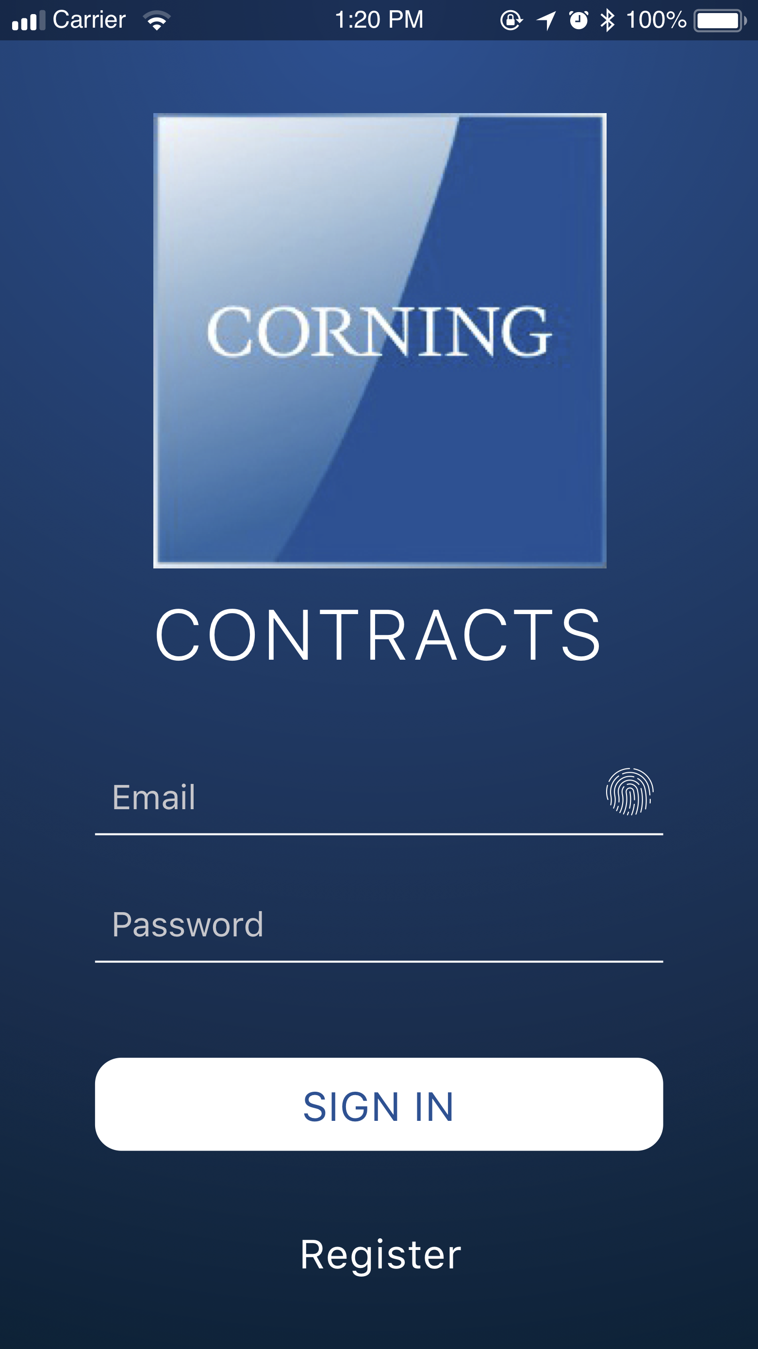
Sign in
It was necessary to have individual customizable profiles (buyers, sellers, etc.) to collaborate on this platform.
Thought process
1. Colors: I came up with 3 colors (dark blue, light blue, white) that represent Corning logo.
2. Animation: I applied “squash and stretch” principle for splash animation denote an organic growth for the company.
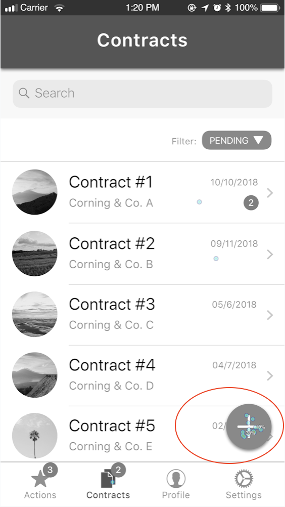
Dashboard
A dashboard to summarize and access the information.
Thought process
1. Principle of Chunking: I designed a 2-step process (limited number of chunks) for creating contract, so that the information is easier to process and remember.
2. Gestalt law of common region: I utilized this principle to display information grouping with an intention of real-world card reading experience.
3. Hierarchy: The “back chevron” in the header bar and denotes the hierarchy of the information and offers user control and freedom to back out of a process.
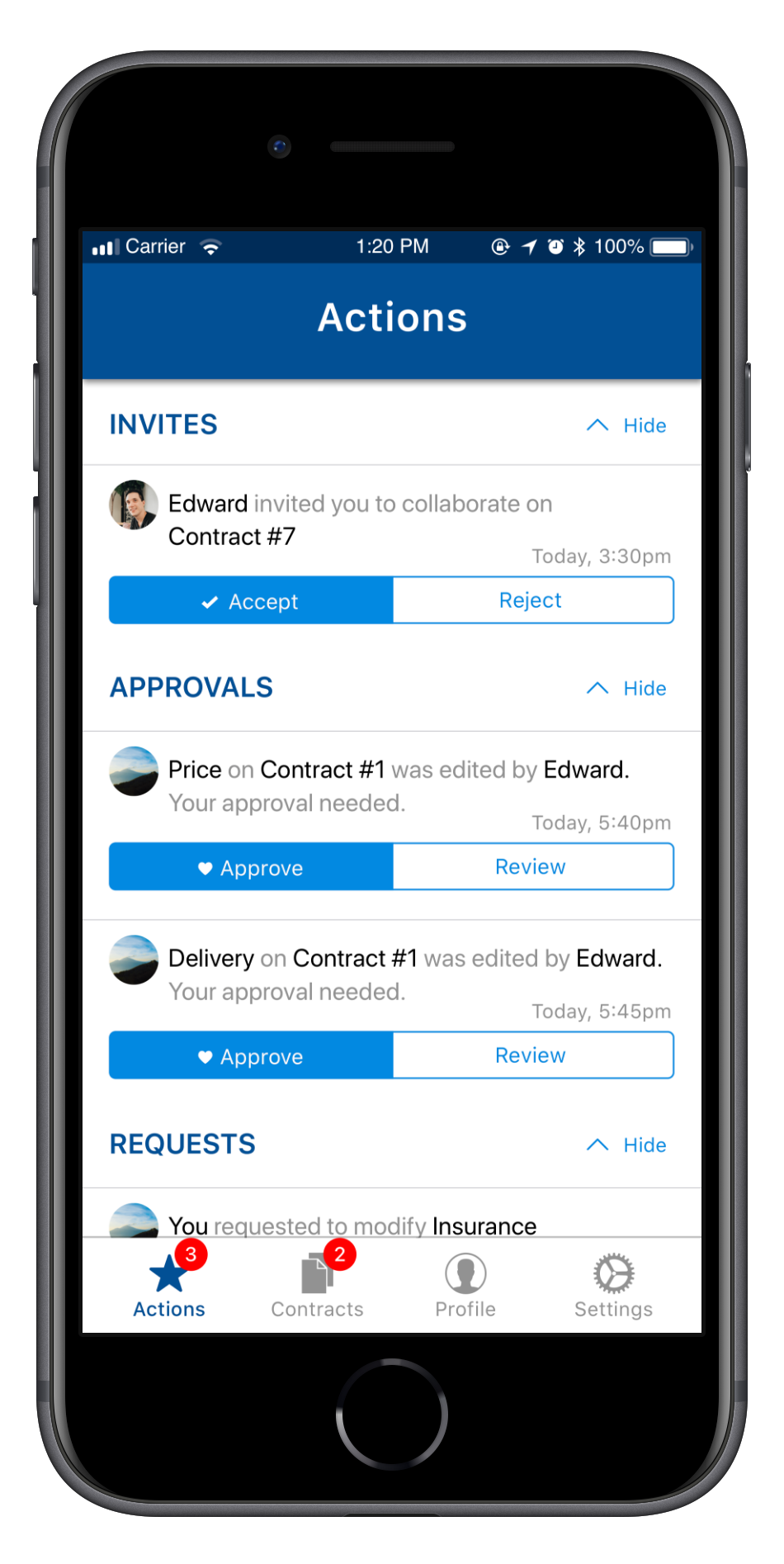
Action Center
A single touchpoint to take contract-related actions, for example, approving contract changes, accepting contract invites, etc.
Thought process
1. Color: The notification bubbles indicates the amount of pending notifications the user has to attend. The reason why the bubbles appear in red because the color “red” has highest wavelength visible to the human eye - naturally making elements appear closer to seek attention.
2. Shape: “Circle” shapes are used in profile icons and in “floating button” because this shape pulls us toward itself thus helping users to focus on the element. Therefore, the profile recognition is improved.
3. Soft corners in UI: For ease of approach and to focus on the content rather than the UI. Sharp corners demand more attention as we perceive it as a threat.
Collaborate
Collaboratively edit contracts like a group chat experience.
Modify Contracts
Modify contract contents like a social media group admin experience.
FIRST-CLICK TEST
The app screens were tested with 16 diverse participants (from USA, India, Saudi Arabia) online using Optimal Workshop’s Chalkmark tool - A first-click analysis tool.
First-click analysis helped me to gauge whether the design elements, especially call-to-actions served its purpose to fulfill users’ goals.
The participants were assigned a total of 4 tasks:
Create contract
Approve changes in contract
Request changes
View the request to modify contract
“On average the app user interface (version 1) had a success of 68% accuracy in accomplishing tasks.”
To know if the app was the right solution, I incorporated questionnaires into the first-click test. Their response to this question, “What impact does the app has in your professional life?”
“Could be cool for freelance projects. I use upward and I think that’s pretty easy.”
“It would allow me to view, accept decline, negotiate contracts on app which saves my time and work.”
“It makes your life go, smooth...”
“Manage and keep track of my contract paperwork, manage several contracts if I manage a team.”
Feedback from Corning Inc.
Tools Required
iOS 11 Human Interface Guidelines, Sketch & Origami Studio.
Lessons Learned
I learned to produce high-fidelity designs in Sketch, high-fidelity POC in Origami Studio, and to conduct first-click analysis using Chalkmark tool.
I realized that entering information through input field could be optimized further by incorporating toggle button instead of dropdown.
If given a second chance, my next step would be to validate my assumptions with end users and conduct usability evaluation on a functional prototype to inform further iterations.


